Adding a Fixed Header to a UIScrollView
I'm currently working on an iPad application which uses a custom calendar control to display a lot of appointments. Similar to Apple's own calendar app, the days of the week are shown within a fixed header bar that's layered on top of the actual grid which renders the appointments as colored rectangles.
Because the calendar needs to be able to show arbitrarily many appointments scheduled at the same time, it's not feasible to cram all seven days of the week into a frame that is only screen wide. If that approach were chosen, an appointment could be just a few pixels wide and thus completely illegible.
The solution is obvious: Besides being able to scroll vertically, the user needs to be able to scroll horizontally, too:
- When scrolling horizontally, the header bar should scroll as well.
- When scrolling vertically, the header bar should stick to the top.
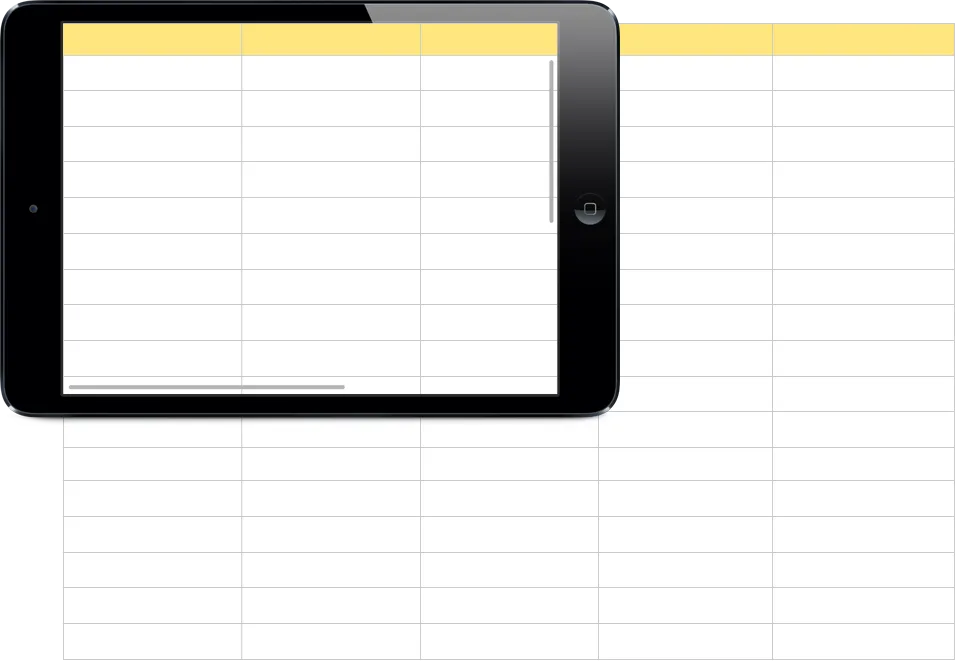
Here's a little mockup showing the initial calendar and the header bar (in yellow):

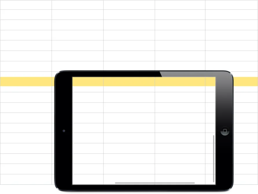
This is how the calendar looks like after the user scrolled in both directions:

Let's look at how we could implement this behavior.
First Thought: Sibling Views #
The calendar is implemented as a UICollectionView to take advantage of the built-in cell reuse and decoration view capabilities. For this problem, though, it suffices to think of it as a plain UIScrollView.
If the user didn't need to be able to scroll horizontally, the header bar could simply be placed outside of and above the UICollectionView. The scroll view would only need to scroll vertically and everything would be fine.
Unfortunately, it's not that easy when horizontal scrolling is to be supported. If placed outside, the header bar wouldn't participate in the scrolling of the UICollectionView in that case, and you'd see incorrectly positioned column headers.
You could think of observing the scroll events of the UICollectionView to update the contentOffset of the header bar manually, but I recommend not to do that. It feels kind of dirty and doesn't play nicely together with a UIPageViewController.
Better Solution: Simulating Stickyness During Layouting #
A better approach is to add the header bar as a subview of the UICollectionView so that it participates in horizontal scrolling. Now we only need to simulate the stickyness of the header bar by continuously updating its location so that it looks attached to the top.
Assuming we have already created a custom class deriving from UICollectionView, we'll override its layoutSubviews: method and implement that behavior there:
private let _headerBar: UIView

/* ... */

override func layoutSubviews() {
    super.layoutSubviews()

    let location = CGPointMake(0, contentOffset.y)
    let size = _headerBar.frame.size

    _headerBar.frame = CGRect(origin: location, size: size)
}
The y-coordinate of the header bar's location is equal to the current vertical content offset, which makes it look like the header bar itself didn't scroll. There are two more little things we should fix, though.
Final Polishment #
Because the header bar is now a subview of the UICollectionView, it hides all content underneath it, which is unfortunate. This problem is easily solved by setting the contentInsets property to a UIEdgeInsets value that only has a top inset configured. The resulting effect is similar to adding CSS padding to an HTML element: The content of the UICollectionView doesn't start at the very top, but further down so that it's not underneath the header bar.
If you want to dot the i's and cross the t's, you can configure the scroll indicator to only scroll up to the bottom of the header bar by assigning the value of the contentInsets property to the scrollIndicatorInsets property as well. Without appropriate insets configured, the scroll indicator would scroll to the very top of the UICollectionView, thus overlapping the header bar; that would feel awkward because the header bar never participated in vertical scrolling.
That's it, there you go! Your UICollectionView now has a sticky header bar.
